W3.CSS Trends
Every year you will see new web techniques and trends.
On this page we will bring you some of the most relevant web design trends.
Flat Design
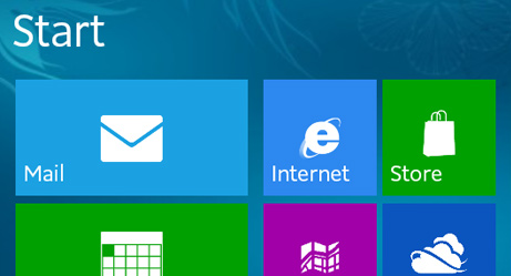
The flat design trend started with Windows Phone 7 and Windows 8 in 2010:
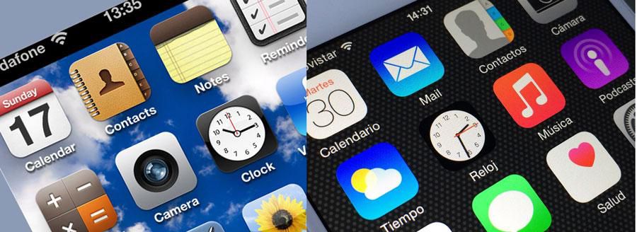
It was followed up by Apple with iOS 7 in 2013:
Flat Design often uses colors we know from marketing, road signs, and sticky notes:
Red
Green
Blue
Yellow
One big problem with flat design is to understand which areas are clickable.
What is the difference between an image and a clickable button?
Almost Flat Design (Flat 2.0)
Almost flat is a newer alternative to the original flat design.
Almost flat acquires more depth, brighter colors, complex shadows, and dimension.
Shadows:
Material Design
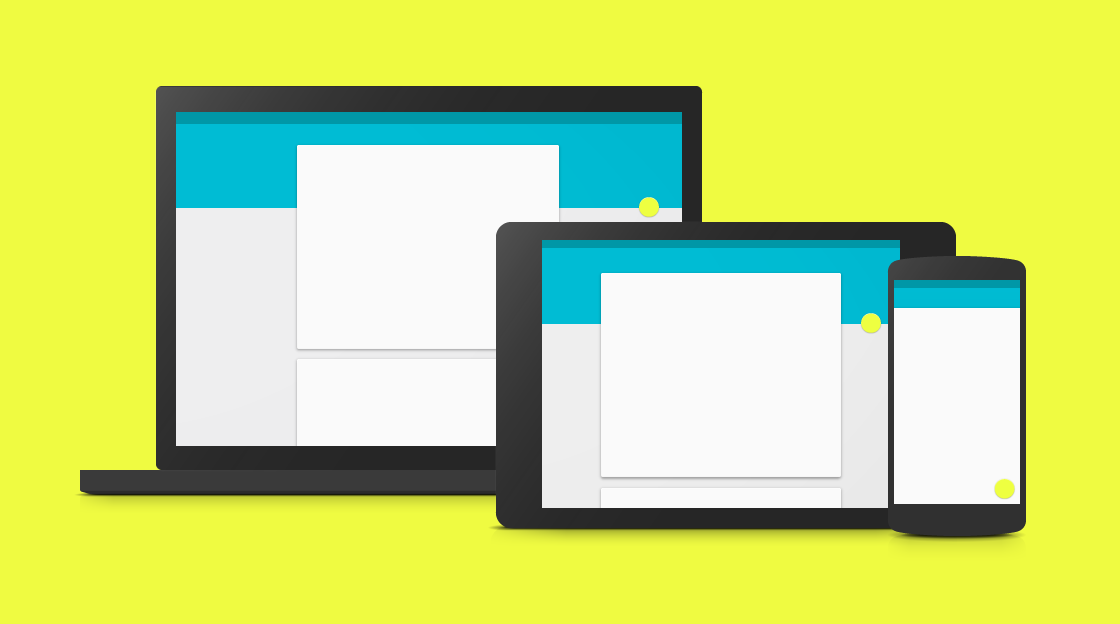
Since we might have reached the peak of flat design (with almost flat), many designers are expected to go for Material Design (Designed by Google in 2014).
Material Design uses elements that remind us of paper and ink. In addition the elements have realistic shadows and hover effects.
Cards
Most typical cards are rectangles with an image and some text.
Cards have become a common structure for organizing headlines, images, and text on an equal plane.
Cards can be small or large, with or without pictures, and with or without shadows:
John
Architect and engineer
John Doe
1 new friend request
CEO at Mighty Schools. Marketing and Advertising. Seeking a new job and new opportunities.
Travel

Cinque Terre. Liguria. Itali.
Cleaner Logos
Cleaner logos is a result of the popularity of flat design:


Minimalism
Easy to read. Easy to understand. Easy to design.
Our Customers
WE WILL ADD REAL VALUE
TO OUR CLIENTS BUSINESS
We know how to make our clients happy
Minimalism can go hand in hand with Almost Flat Design:
About Me
The term minimalist often refers to anything that is spare or stripped to its essentials.
Design minimalism can help simplify and improve designs as well.
Readable Typography
The natural typography of flat design is simple and easy to read.
Letter-spacing and line-spacing is typically larger.
Also expect increased font sizes in order to focus more on reader's attention.
Standard Serif
Simplicity and readability is the most important reason for flat design. Simplicity and readability is the most important reason for flat design. Simplicity and readability is the most important reason for flat design.
Standard Sans Serif
Simplicity and readability is the most important reason for flat design. Simplicity and readability is the most important reason for flat design. Simplicity and readability is the most important reason for flat design.
W3.CSS Typography
Simplicity and readability is the most important reason for flat design. Simplicity and readability is the most important reason for flat design. Simplicity and readability is the most important reason for flat design.
Readability is an important reason for the popularity of flat typography.
Full Screen Input
More and more sites are using full screen for inputs like signups and logins, instead of using only a small part of the page.
Full screen often uses a screen overlay or modal instead of redirecting to a new page.
Class Registration
Mobile First
Historically, web designers have developed web applications for computers first, and then added responsive web design to make sure the web looks good when viewed on a tablet or a phone.
This trend is shifting towards designing for mobiles first, and then add responsive design to make a site work on desktops and laptops.
50/50 is an easy way to achieve web design for responsive webs. With 50/50 design, the screen can show two pages on large screens and one page on narrow screens.
My Work
Some of my latest projects.




Just call me awesome.
About Me
Lorem ipusm sed vitae justo condimentum, porta lectus vitae, ultricies congue gravida diam non fringilla.
Swing By
Contact
GET IN TOUCH
Large Hero Images
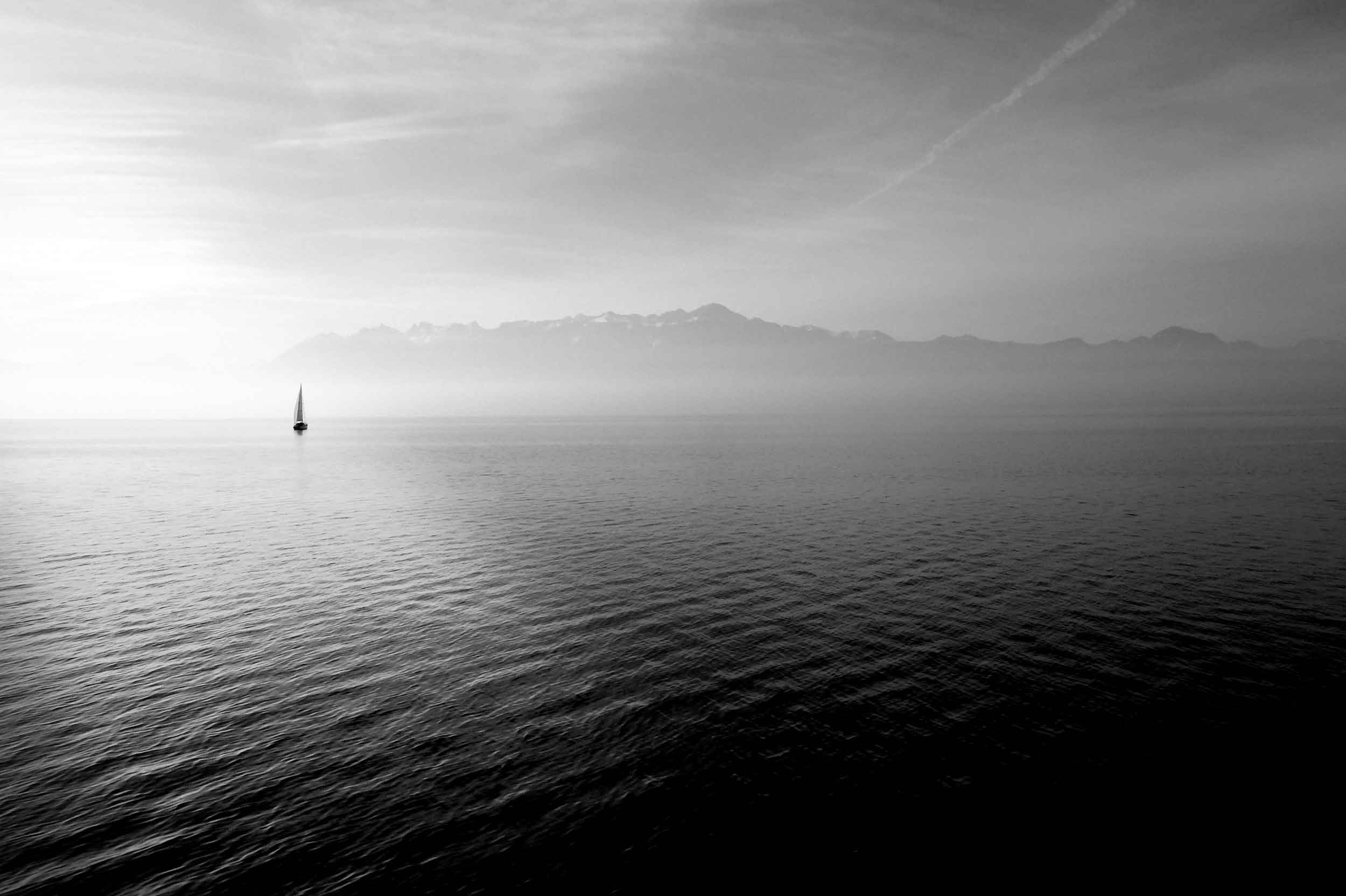
"Hero image" is a term used for a specific type of web banner.
A hero image is a large image, placed in the front of a web page. It often consists of both an image and some text, and it can be static or a rotating list of images.
The purpose of an hero image is to present the web site's most important content.
Brought to you by Captain Hook
Welcome to my Sailing Web
Sailing comprises wind propulsion of a craft by means of sails and steering it over water, ice or land, depending on the type of craft. A sailor manages the force of the wind on the sails by adjusting their angle with respect to the moving sailing craft and sometimes by adjusting the sail area. The force transmitted from the sails is resisted by forces from the hull, keel, and rudder of a sailing craft, by forces from skate runners for an iceboat, and by forces from wheels for a land sailing craft to allow steering a course on a point of sail with respect to the true wind. (Wikipedia)
Single Page
The web design trend shifts from regular clicking to vertical scrolling.
Scrolling allows users to see all the web content on the one page.
This single page technique has been used by social networks a long time, until somebody discovered that it suits other pages as well.
